Wednesday, 4 March 2020

Introduction to advertising


Image result for print adverts shoes

1) What key conventions of an advert can you find and what are the connotations of each one?     
     Key image - To help sell the image  and increase the understanding of the product.
     Brand, logo and name - So that it can quickly be recognised in store or online e.g. The Nike logo on the                                               advert.  
     Slogan-  ' just do it ' this is an imperative as it is telling the audience to do something.
     Text (anchorage) - the paragraph in the middle gives a little background history.              


2) For each convention, write about how this appeals to a target audience. 
Key image - it looks colourful and stylish.
Slogan - It appeals as the slogan is telling you to do something and makes you feel powerful.
text (anchorage) - It appeals as it tells the viewers how good and how the product is. 
logo - Its sharp and shows the shows will probably make you run faster because it looks like a lightning bolt.

3) What is the USP (unique selling point) of the product and how do you know?
 The logo because no other uses or can use the Nike tick because it would be copyright.   

Extension task

If you have completed an in-depth analysis of an advert of your choice, do some additional research into creative or powerful print advertising. 

Task: Find a an example of a print advert for EACH of the following:

1) A clear brand identity
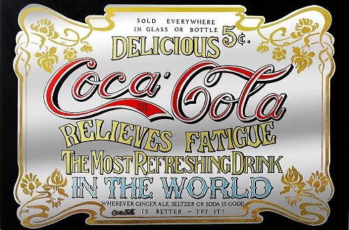


Image result for clear brand identity


2) A shocking or controversial idea
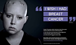

Image result for A shocking or controversial idea ad

3) An emotional connection to audience


Image result for emotional ad


4) An innovative or ‘different’, subversive concept (e.g the porcupine advertising VW car)


Image result for innovative ads

5) A foreign advert that you can understand despite the language barrier
Image result for An emotional  ad
Image result for foreign ads
Finally, write what the USP is for each advert.

1) The USP for the first one is the coca cola logo
2) The USP is the emotional face
3) The USP is the UNICEF logo
4) The USP is the cigarette and the car
5) The USP is the Nutella jar


Tuesday, 3 March 2020

Magazine assessment: Learner Response


1) Type up your feedback in full (you don't need to write the mark and grade if you want to keep this confidential).


  Total = 9 = Grade 3 


WWW - You start well with good knowledge of magazine cover conventions but after that this is quite a harsh             lesson is exam technique.

EBI - You need to read and answer the question - e.g. in Q3 it asks about British cultural values 
      - In Q2 you need to write about the connotations in the text to move towards the higher levels.

LR - See blog


2) Read the mark scheme for this assessment carefully. Write down the mark you achieved for each question:

Q1: 2/2
Q2: 4/12
Q3: 3/8

3) Did you get any media terminology wrong in the assessment? Make a note of it here for future revision:


4) Look specifically at question 2 - pick out three points from the mark scheme that you didn't include in your analysis of the unseen Grazia magazine cover.


  • Direct address of main image from Grazia, Kate Middleton, staring at the audience and reflecting the topic of the cover line.
  •  The central image is anchored by the caption underneath drawing the audience’s attentionto the main sell of the magazine.
  • All around the main image in a neatly packed style, other features that will appeal are listed.This communicates to the audience that the magazine has a lot to offer them.


5) Now look at question 3. Use the mark scheme to identify three points you could have made regarding how Tatler reflects British social and cultural values.


  • Georgina Bevan a young British model. Trying to modernise audience readership ‘more edgy’which links to the idea of ‘new posh’ and ‘21 st century’. Her costume includes pearls and jewellery which connotes wealth and luxury and status. Complemented by the gold brocade of her outfit which is reminiscent of royalty.
  • The title originates from the verb ‘tattle’ which suggests gossip and exploring the lifestylechoices made by middle/upper-middle class target audience.
  • The cover line referencing ‘Millennial Sloanes’ reinforces the young upper-middle andmiddle class target audience that this magazine could potentially appeal to.


Wednesday, 12 February 2020

Reveal: case study blog task


Media language

1) How many of the 12 magazine cover key conventions feature on this edition of Reveal? List them with            specific reference to the convention on the CSP edition of Reveal.

-  Typography - The title is in sans serif font to make look more modern.
-  Price  -  Big, bold and a bright yellow to make stand out  
-  Main flash  - uses star appeal to make stand out so the audience buy it.
-  colour scheme  -  Red, white and pink to show its mainly aimed towards female


2) What is the font choice used on the cover and what does this choice connote? 

   The font choice used in the title is sans serif to make it more modern.

3) How do the cover lines appeal to the Reveal target audience?
    
   It makes the audience want to buy it more as it shows that it is the latest gossip and you can't get it               anywhere else.

4) What are the connotations of the Reveal colour scheme on this particular front cover?  
    
    There are a lot of bright colours, such as white and yellow there is also red and pink to show that it is            mainly aimed at females. 

                    
5) How are images used to create interest in the magazine? Find three reasons for your answer. (E.g. mise-        en-scene such as props, costume and make-up, body position, facial expression).

   Images create interest in the magazine with: 
   facial expressions - The facial expressions on their faces are either look happy or angry which suggest             there is a lot of gossip  
   Costume - The clothes look expensive which probably means the are fashion design     Body positions - their bodies are facing away from the camera which shows they are paparazzi shots.

6) What differences can you find between the use of design and typography between Tatler and Reveal? List at least three and explain the effect on audiences.

  On the Tatler cover the words are mainly written in serif and on the Reveal are mainly written in San-serif      this is because :
  San - serif is more modern 
  serif is more traditional and formal   


Representations


1) What type of celebrities appear on the front cover? How are they represented in Reveal? (Positive? Negative? Reinforcing or challenging stereotypes?)           

    The types of celebrities being shown on the cover are from reality shows and females represented in a            negative way as it reinforces stereotypes of women about : motherhood, diet, beauty and relationships. 

2) How are women represented on the cover of Reveal? Think about both images and cover lines here.

      Women are represented as mothers as it talks about pregnancy and having children.

3) How do Reveal and Tatler represent social class? (E.g. middle/upper class and working class)
     
    Reveal is aimed at working class as it is affordable, about celebrities and their lifestyle but with Tatler it        is aimed at upper class and upper middle class  as it talks about unaffordable jewellery that can only be        bought by a higher class society. But they both only show White people and there is no sign of black or           Asian.

4) What would be the preferred and oppositional readings to this cover of Reveal?

    The preferred reading is that Reveal is aimed at women as the colour on the cover is mainly pink or bright     colours which is usually associated with women.

    The oppositional reading would be that reveal is not for men as it is mainly about celebrity gossip and           gossip is a stereotype associated with women.  


Social and cultural context


1) What aspects of British life are reflected in Reveal? How does this compare to Tatler?
    
    The lifestyles represented in reveal are about motherhood and going on diets.

2) What do the cover lines in Reveal suggest about the issues and lifestyle of Reveal readers?

    The cover lines suggest that Reveal is like the readers best friend.

3) Find three other front covers for Reveal. What issues or features regularly appear in Reveal? 
    
In Reveals front cover the main things shown are:
Women
Relationship stories
Diet


Grade 8/9 extension tasks

1) How does the front cover engage audiences with possible narratives? Look for stories, cliffhangers, dramatic cover lines etc.

It takes quotes from different stories and put them on the front cover which wants the reader to read more so they buy it.

2) What are paparazzi images and why are they crucial to the front cover of Reveal? 


   Paparazzi images are images taken from photographers without taking permission from     the celebrities. They are important in reveal because it makes the cover look more           exciting.


3) How does the front cover juxtapose text and images to create contrast and narrative on the front cover of Reveal 18 March 2017?

The front cover make the text and images close to each other.


4) What do these two magazines suggest about representations of social class in the British media?
   
   It represents the lifestyles and only show white people.


Thursday, 6 February 2020

Tatler: Case study blog tasks

Introduction - Tatler Media pack


1) Look at the Tatler Media Pack. Go to page 2: how does the editor introduce the magazine?

   She describes Tatler with very high vocabulary and targets it towards rich and posh people 

2) Now go to page 4 of the Media Pack. Focus on the print magazine (NOT tatler.com - the website). List the key demographic details: age, gender %, ABC1 % (social class), HHI (Household Income), % of those living in London and the South East. What do these demographic details suggest about the average Tatler reader?

Circulation 80,035
Readership 163,000
Average HHI £261,572
Female 73% ABC1 83%
AB 51% Average Age 41

London/SE 70%

This suggests that Tatler is for a more higher class society, an older range and aimed mainly at women.  

3) Look at page 6. What do Tatler readers think about fashion? How much do they spend?

    Tatler readers see fashion in a way to make them feel younger. They spend thousands of pounds to buy          designer fashion.

4) Go to page 10. What are the special editions of Tatler that run throughout the year? What does this suggest about the pyschographic groups who read Tatler?

JANUARY
Travel Guide

MARCH
Weddings Guide

APRIL

Beauty & Cosmetic Surgery Guide

JUNE
Spa Guide

JULY

Watches & Jewellery Guide

OCTOBER
Schools Guide
(inc. Totler)                               

This suggests that the pshycographic groups that read Tatler people who have rich lifestyle and interest in fashion and beauty.

 Media language


1) What different examples of typography can you find on the cover of Tatler? What are the connotations of the serif and sans serif fonts? 

The title is a sans serif font, the main flash and cover lines is in a serif font.


2) How do the cover lines appeal to the Tatler target audience?

It tells the audience a little bit of information so it makes them want to read it more and they might buy it.


3) What are the connotations of the Tatler colour scheme on this particular front cover? 
    
    The connotations of the Tatler colour scheme is green to show nature and it is fresh and modern, Pink to        show the feminism and black and white as it is an upper class colour.

4) How is the central image designed to create interest in the magazine? Find three reasons for your answer. (E.g. Mise-en-scene such as props, costume and make-up, body position, facial expression)

   It makes it interesting as when we look in the middle the first thing we see is the eyes, so we can see the       facial expression. The make up e.g. mascara is bold which suggest she is powerful. The costume e.g.             jewellery and clothes must have been very expensive so this suggests that there is a lot of things about         fashion.


  Representations


1) What different groups of people are represented on the cover? (E.g. men/women/white people etc. Look at the image and text/cover lines to help here) 

The groups of people that are represented on the front cover are all White, rich, upper class people.

2) What do the cover lines suggest about the lifestyle of rich people in the UK?
    This suggests that the lifestyle of rich people in the UK is very modern as they by designer fashion  

3) Are there any stereotypes being reinforced or subverted? How? Why?
    The cover has a women on it wearing make up, jewellery and a dress. This suggests women have to look        and dress in a certain way.     
4) What would be the preferred and oppositional readings to this cover of Tatler?


The preferred reading of the Tatler cover is that it is a posh but modern magazine, it's up to date and moves  with the times.

The oppositional reading is that they are show offs who don't know what a normal lifestyle and do not care about other people.  

Social and cultural context


1) What aspects of British life or people are NOT reflected in Tatler? (Watch the clip above again if you need help with this - the clue is in the title 'Posh People') 
The people who are not mentioned in Tatler are working or middle class because Tatler is seen as a higher class magazine so the don't want to associate Tatler with  lower class people.


2) Tatler runs special issues on holidays, spa breaks, cosmetic surgery, watches and jewellery and private schools. What does this suggest about the magazine's representation of life in Britain? 
This suggest how life in Britain is when you are part of a upper class family. This also shows their general lifestyle.

   3) What audience groups might be offended or insulted by the front cover of Tatler April 2017? 

The students who are taking a one month gap year as they are saying it is pointless.

4) Find three other front covers for Tatler. What issues, subjects or people are regularly featured in Tatler?  
    Women, Higher class people and celebrity's. 


Sunday, 26 January 2020

January assessment Learner Response


1)

     Total = 12 = Grade 3

WWW - Your 20-mark essay question is well organised into paragraphs and shows good focus on the question. With some improvement in exam technique I'm confident this grade will move higher.

EBI - Revise vertical integration!
       - for questions on texts (e.g. Q3 + Q6) you need to make detailed reference to the texts  -                        particularly examples from CSPs
         - E.g. for Q6 you needed lots of examples of I, Daniel Blake + Doctor Strange's budget, box                office, marketing campaigns etc.
     
LR - See blog


2)

Q1:1/1
Q2:0/1
Q3:3/8
Q4:0/2 - I need to revise what vertical integration
Q5:2/2
Q6:6/20

3)
     Vertical Integration
4)

     For the preferred reading I wrote that the poster suggested that women are strong.
     For the oppositional reading I wrote that women shouldn't be working and are powerless.

 5)
        Vertical Integration - It is when one conglomerate owns different companies in the same chain             of production.
6)

 Paragraph 1: Independent films such as I, Daniel Blake aren't as big and well known as Hollywood                          blockbusters.

Paragraph 2:   Hollywood blockbusters spend and make lots of money so they can afford to get big                             movie stars who are well known whereas independent films don't have that much                                 budget to pay big actors.

Paragraph 3: I, Daniel Blake doesn't have a big budget to spend on CGI, green screen and action so                          less people would want to see it. But doctor strange has a big budget to spend on these                          things and they appeal to a wider range of audiences.

Paragraph 4: Doctor strange have an advantage as they already have a wider range of audience as                            Doctor strange is part of the marvel series so they will have more of an audience to                              watch their films, so their box offices will be making millions. But I, Daniel Blake don't                      have that big of an audience less people will go to see that film.